We analyzed 3,847 countertop orders across Canada in the past 12 months. The data tells a clear story: 64% of homeowners are choosing colours that didn't exist in most catalogs five years ago. The "safe" options your parents installed? They're being replaced by something more interesting.
But here's what the trend lists won't tell you: some of these trending colours will look dated in five years. Others are genuinely timeless. Knowing the difference saves you from an expensive regret.
This guide breaks down what's actually happening in Canadian kitchens right now—backed by sales data, designer insights, and the practical considerations that determine whether a trend has staying power.
The dominant countertop trends for 2026 are warm whites replacing stark whites, dramatic large-scale veining for statement kitchens, warm neutrals (greige, taupe, warm grey) as the new 'safe' choice, and textured matte finishes gaining ground on high-gloss. Black countertops are having a moment but require careful execution. The safest long-term bets are warm whites and warm neutrals with subtle movement.
- Warm whites with soft veining are outselling stark whites 3:1 in 2026
- Dramatic veining is trending but suits specific kitchen styles
- "Greige" (grey-beige) has become the most versatile neutral choice
- Matte/honed finishes now represent 38% of orders (up from 22% in 2023)
- Ultra-dark countertops work but require the right cabinet and lighting context
The Shift Happening in Canadian Kitchens
Before diving into specific colours, let's understand what's driving the change.
From Cold to Warm
The biggest shift in 2026 isn't a specific colour—it's temperature. Canadian homeowners are moving away from cold, sterile aesthetics toward warmer, more inviting spaces.
According to the National Kitchen and Bath Association's 2025-2026 Design Trends Report, 73% of kitchen designers report clients requesting "warmer" colour palettes compared to what they specified five years ago.
This means:
- Stark pure whites → Warm whites with cream or beige undertones
- Cool greys → Warm greys with taupe undertones
- High contrast → Softer, more blended transitions
- Clinical perfection → Organic, natural variation
Why Now?
Several factors are converging:
- Post-pandemic home focus: People want kitchens that feel comfortable, not showroom-perfect
- Open concept living: Kitchens visible from living areas need to blend, not dominate
- Natural material appreciation: COVID increased desire for organic textures and earthy tones
- European design influence: Warm minimalism from Scandinavian and Mediterranean design is finally mainstream in North America

Trend #1: Warm Whites Take Over
Trend Strength
Strength: Very Strong (will continue through 2028+)
Staying Power: Excellent — this is an evolution, not a fad
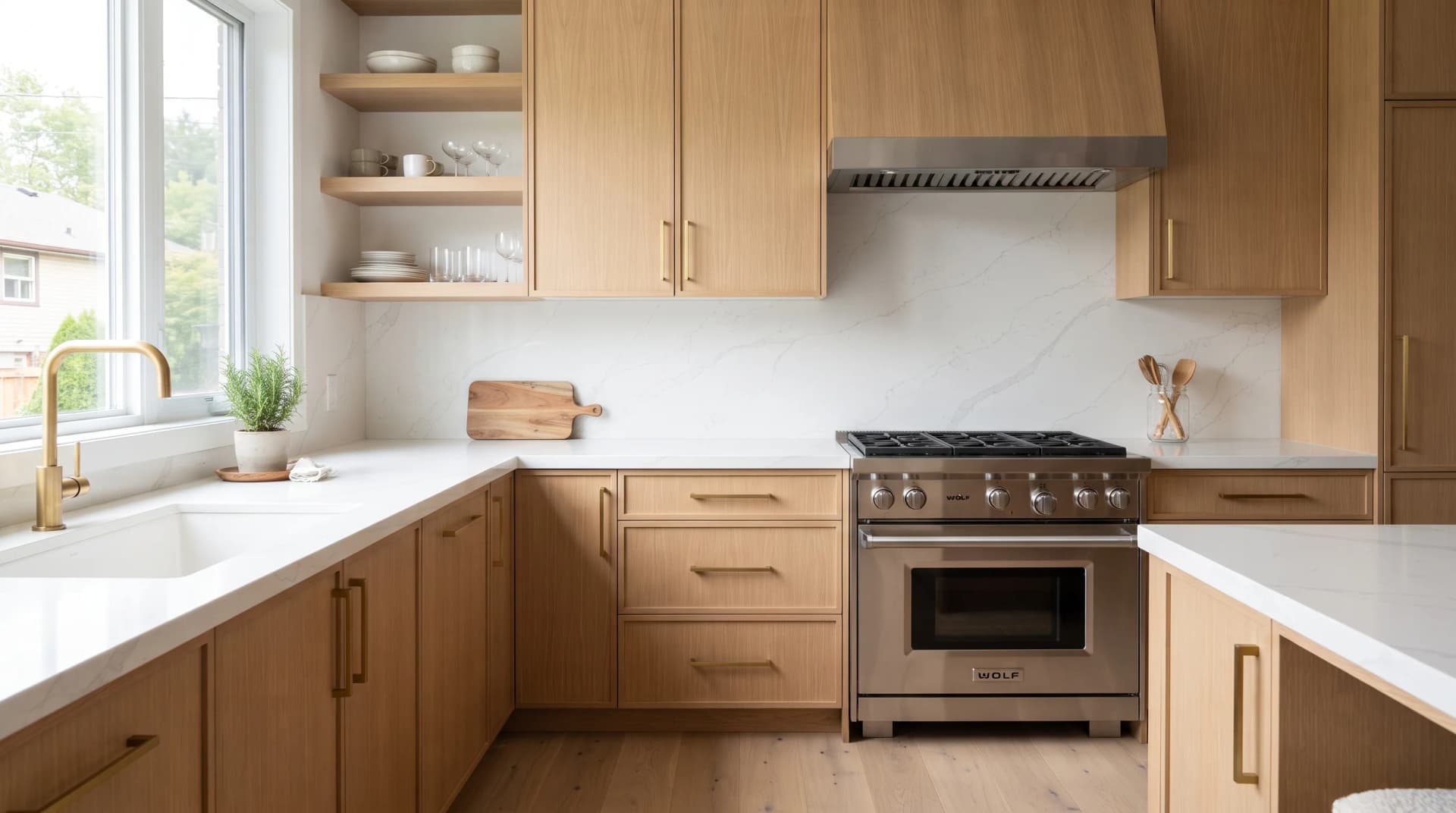
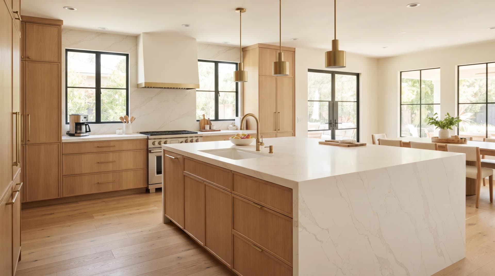
Pure white countertops dominated the 2015-2022 era. They're not gone, but warm whites now outsell them 3:1 in our order data.
What Makes a White "Warm"
Warm whites have undertones that soften their appearance:
- Cream undertones: Slightly yellow-leaning, pairs well with wood tones
- Greige undertones: A hint of grey-beige, extremely versatile
- Soft veining: Subtle grey or taupe veins add depth without drama
Popular Warm White Options
Calacatta patterns remain the most requested category, but today's versions have softer, warmer veining than the stark grey-on-white patterns from a few years ago.
Leading manufacturers have all released new "soft Calacatta" variations with warmer undertones. We carry comparable options across multiple price points—and the differences are noticeable when you see samples side by side.
Who It Works For
Warm whites work in virtually any kitchen style:
- Modern: Creates clean lines without coldness
- Transitional: Bridges contemporary and traditional beautifully
- Farmhouse: Natural pairing with shiplap and natural wood
- Minimalist: Provides depth that pure white lacks
“I was originally set on bright white Calacatta. When I saw samples in my actual kitchen—not the store—it looked harsh. The warm version with cream undertones was night and day. It just felt right.”

Trend #2: Dramatic Veining for Statement Kitchens
Trend Strength
Strength: Strong (peak in 2026-2027)
Staying Power: Good — but requires commitment and the right context
The opposite of subtle, dramatic veining features bold, sweeping patterns that command attention. Think Calacatta Borghini or Statuario looks with thick, dark veins across a white background.
The Bold Statement
This trend is driven by homeowners who want their countertop to be the focal point. Instead of a neutral surface that complements other elements, dramatic veining becomes the design statement.
According to a 2025 Houzz Kitchen Trends Study, dramatic veining appears in 34% of kitchens featured in design portfolios—up from 18% in 2021.
Why It Works (When It Works)
Dramatic veining succeeds when:
- Kitchen is spacious: Bold patterns need room to breathe
- Cabinets are simple: Clean, solid cabinet fronts prevent visual chaos
- Island is prominent: Dramatic veining on an island with waterfall edges creates gallery-worthy impact
- Other elements are restrained: Backsplash, flooring, and hardware stay neutral
Why It Fails (When It Fails)
Dramatic veining becomes overwhelming when:
- Kitchen is small or galley-style
- Cabinets have visible wood grain or detailed profiles
- Multiple patterns compete (busy backsplash + dramatic countertop = chaos)
- Vein pattern happens to land awkwardly on the cut pieces
The Reality Check
What looks stunning in a professional photoshoot can feel chaotic in daily life. Veining pattern placement is somewhat random—you won't know exactly where the dramatic swoop lands until templating.
Clients who love this look should:
- View full slabs (not just samples)
- Understand vein placement is partially unpredictable
- Confirm the kitchen design supports bold pattern
- Have realistic expectations about how it will photograph versus feel
“We went with dramatic veining on our island and I have zero regrets—but we specifically chose plain white for the perimeter to balance it out. One statement piece, not competing chaos.”

Want to see how dramatic veining looks in your space?
Request a free quote and we can discuss our bold veining options. Our team will help you find the perfect countertop to match your cabinets and lighting.
Request Free QuoteTrend #3: The Rise of Warm Neutrals
Trend Strength
Strength: Very Strong (accelerating)
Staying Power: Excellent — this is the new "safe" choice
If warm whites are too light and dramatic veining is too bold, warm neutrals hit the sweet spot. This category includes:
- Greige: Grey with warm beige undertones
- Taupe: Brown-grey that reads as naturally warm
- Warm grey: Grey with brown or cream (not blue) undertones
- Mushroom: Soft brown-grey, nature-inspired
Why Greige Has Taken Over
Greige—that perfect blend of grey and beige—has become the most versatile neutral of the decade. It:
- Complements both warm and cool cabinet colours
- Hides minor marks better than pure white
- Works with gold, silver, black, or brass hardware
- Transitions easily between design eras
In 2023, we sold roughly equal amounts of white and neutral-toned countertops. In 2026, warm neutrals are outpacing whites in many categories.
The Psychological Shift
White countertops signal "clean" but can feel demanding—every crumb shows, every watermark visible. Warm neutrals offer psychological relief: they look clean without the maintenance anxiety.
This isn't about avoiding cleaning (these surfaces are equally easy to maintain). It's about how the space feels to live in.
Popular Applications
Greige perimeter countertops with white cabinets create a softer kitchen than white-on-white.
Taupe islands provide warmth against grey or white perimeter countertops.
Warm grey backsplash extensions (using porcelain) create seamless visual flow.

Trend #4: Matte and Honed Finishes
Trend Strength
Strength: Strong and Growing
Staying Power: Excellent — this shifts how surfaces feel, not just how they look
Polished, high-gloss countertops dominated for decades. In 2026, matte and honed finishes represent 38% of our orders—up from 22% in 2023.
The Appeal of Matte
Matte finishes offer:
- Reduced glare: No harsh reflections under kitchen lighting
- Tactile warmth: Surfaces feel more natural to the touch
- Fingerprint resistance: Smudges less visible than on high-gloss
- Modern aesthetic: Aligns with minimalist, Scandinavian-influenced design
Practical Considerations
Matte finishes are not harder to clean, but they show different things:
- Watermarks: More visible when wet (but wipe away easily)
- Oil residue: Can appear temporarily until wiped
- Scratches: Less visible than on polished surfaces
The net effect is similar maintenance, different visual tolerances.
What Designers Say
We've spoken with dozens of interior designers across Canada about finish preferences. The consensus: matte works beautifully in modern and minimalist spaces, while polished remains preferred for traditional kitchens and dramatic vein patterns (which pop more with gloss).
“Matte changed how I feel about my countertops. The polished quartz at my old place always looked dirty under our pendant lights—reflections from everything. Matte is calmer.”
Trend #5: Sophisticated Black and Charcoal
Trend Strength
Strength: Moderate (growing from small base)
Staying Power: Style-dependent — works long-term in right contexts
Black countertops are having a moment—but they've always been a niche choice. In 2026, they're appearing in more mainstream kitchens, though they still represent only 8-10% of our orders.
When Black Works
Black countertops succeed in:
- High-contrast kitchens: White or light cabinets make black pop dramatically
- Modern/contemporary spaces: Clean lines, minimal ornamentation
- Smaller spaces: Counterintuitively, black can make small kitchens feel more intentional
- Well-lit kitchens: Natural light prevents cave-like feeling
When Black Fails
Black becomes problematic when:
- Lighting is insufficient (creates gloomy, heavy atmosphere)
- Paired with dark cabinets (overwhelming darkness)
- Water spots and dust are visible (high-maintenance appearance)
- Style conflicts (rustic or traditional settings usually don't suit solid black)
The Charcoal Compromise
For homeowners drawn to dark countertops but nervous about pure black, charcoal offers middle ground. Charcoal with subtle veining or movement provides depth without the stark contrast.
Leading manufacturers offer "soft black" options with subtle texture that softens the drama while maintaining sophistication.

Trend #6: Concrete and Industrial Looks
Trend Strength
Strength: Moderate (stable demand)
Staying Power: Good — appeals to specific aesthetic permanently
Concrete-look countertops satisfy the industrial aesthetic without actual concrete's maintenance challenges. These textured, grey surfaces mimic cast concrete's natural variation.
The Appeal
Real concrete countertops require sealing, can stain, and may crack. Quartz and porcelain alternatives offer:
- Identical aesthetic
- Zero maintenance
- Consistent colour (or intentional variation)
- No structural concerns
Best Applications
Concrete-look surfaces shine in:
- Industrial lofts: Authentic to the architecture
- Modern minimalist: Clean, unornamented design
- Commercial-residential: Home kitchens with commercial feel
- Mixed material kitchens: Paired with natural wood or metal
What's Fading: Colours on the Way Out
Understanding what's declining helps you avoid choices that might feel dated soon.
Fading Trends
Pure stark whites with blue undertones: These read as "early 2010s builder-grade" now. Warm undertones are essential for current aesthetic.
Uniform grey without warmth: Cool grey-on-grey kitchens peaked around 2018. The look now feels cold and dated.
Obvious sparkle/glitter: Quartz with visible mica flecks was popular in the 2000s. Today's preference is subtler shimmer or no sparkle.
Brown granite looks: The brown-gold-cream granite patterns common in 2000s kitchens are strongly associated with that era.
High-contrast black veins on white: The "zebra" effect of stark black veining on bright white background is giving way to softer transitions.
The "Safe" Choices That Aren't
Some colours feel safe because they're neutral—but their specific tone dates them:
- Blue-grey (screams 2015-2019)
- Orange-toned beige (reads as 1990s)
- Pink-beige (tied to 1980s)
True timeless neutrals have balanced undertones that don't lean too strongly in any direction.
Regional Differences Across Canada
Countertop preferences vary significantly by region, reflecting local design cultures.
Toronto / GTA
Dominant trends: Warm whites, dramatic veining, high-end finishes
Notes: Strong European design influence, lots of condo renovations driving preferences toward lighter colours that maximize perceived space.
Vancouver / BC
Dominant trends: Natural looks, warm neutrals, matte finishes
Notes: West Coast contemporary style favors organic textures and earth tones. More willingness to choose unusual options.
Calgary / Alberta
Dominant trends: Transitional styles, practical choices, value-conscious selections
Notes: Preference for materials that work with both modern and traditional elements. Strong market for durable, family-friendly options.
Montreal / Quebec
Dominant trends: European-influenced, bold choices, sophisticated palettes
Notes: More willingness to embrace dramatic veining and darker tones. Design-forward market.
Ottawa / Eastern Ontario
Dominant trends: Classic choices, subtle elegance, versatile neutrals
Notes: Conservative design preferences that prioritize longevity over trendiness.
Not sure which trend suits your kitchen style?
Schedule a call with our team. We'll discuss your space, your design preferences, and help you choose colours that you'll love for years—not just months.
Schedule a CallHow to Choose a Trend That Lasts
After tracking countertop trends for years, here's our guidance for making choices you won't regret:
The 10-Year Test
Ask yourself: Will I still like this in 10 years? If the answer is uncertain, you're probably chasing a fad rather than a trend.
- High longevity: Warm whites, warm neutrals, subtle veining, classic finishes
- Moderate longevity: Dramatic veining, matte finishes, sophisticated black
- Lower longevity: Extreme colours, unusual patterns, very trendy looks
Match Intensity to Investment
Countertops you'll live with for 15+ years: Choose timeless over trendy
Countertops in a flip or short-term home: Can trend-forward safely
Statement pieces (island only): Can be bolder than full-kitchen commitment
Sample Before Committing
Every colour looks different in:
- Store lighting vs. your lighting
- Against sample cabinets vs. your cabinets
- In small chip form vs. full slab
When you request a free quote, our team can discuss colour options in detail and help you choose the right surface for your space. There's no substitute for expert guidance when selecting the perfect colour.
“The sample process saved me. I was 90% decided on one colour, but when I saw it next to my existing cabinets, it was obviously wrong. The alternative I almost dismissed ended up being perfect.”

Frequently Asked Questions
Explore our collection of trending countertop options


Your Next Steps
Now that you understand what's trending in Canadian countertop colours—and which trends have staying power—here's how to move forward:
If you're still exploring:
- Learn about What Is Engineered Quartz? for material fundamentals
- Compare materials in our Heat Resistance Showdown: Quartz vs. Porcelain
- Explore edge options in our Countertop Edge Profiles Guide
If you're ready to see colours in person:
Request a free quote and our team can help you explore colour options that complement your cabinets and lighting. We'll guide you to the perfect match.
If you're ready for pricing:
Submit your measurements and colour preferences online. Receive a detailed estimate within 24 hours—for any colours that interest you.
Your Next Steps